Grey House
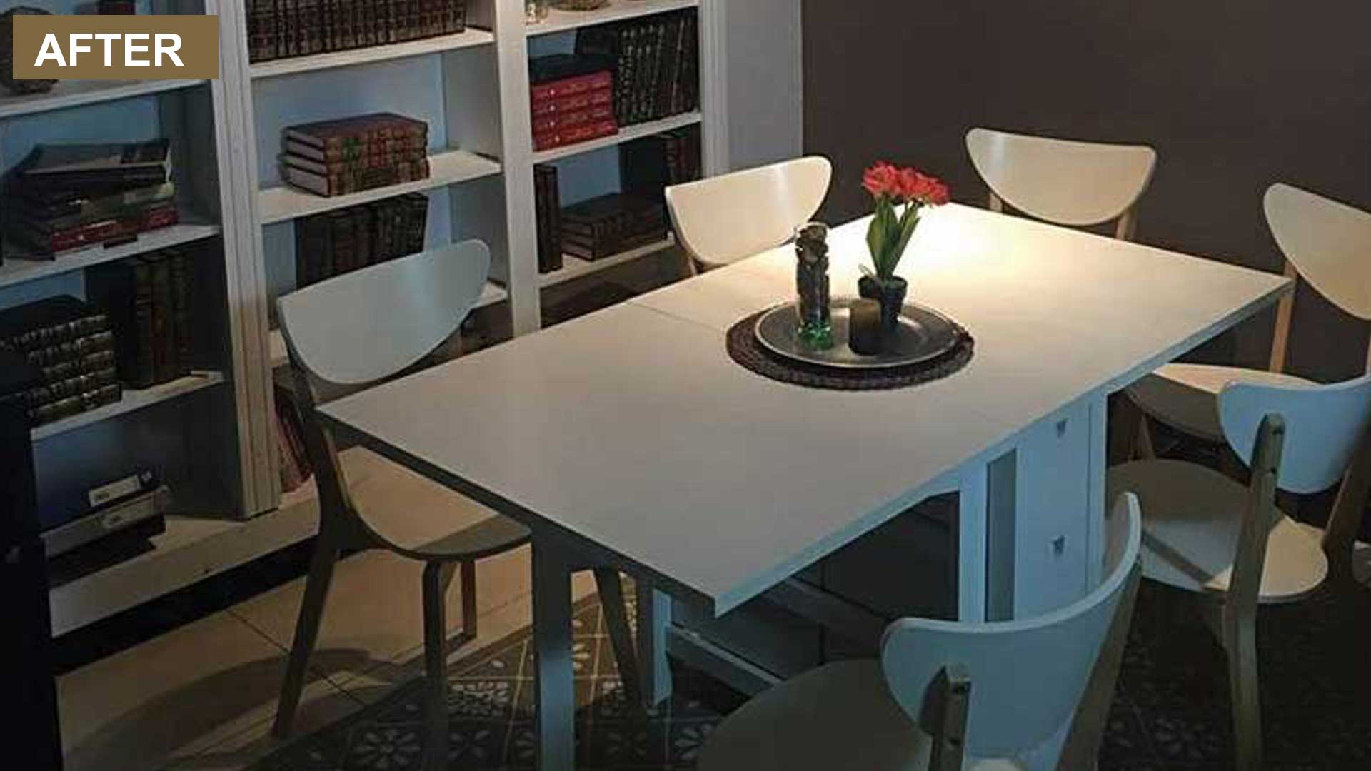
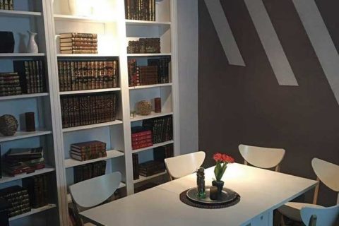
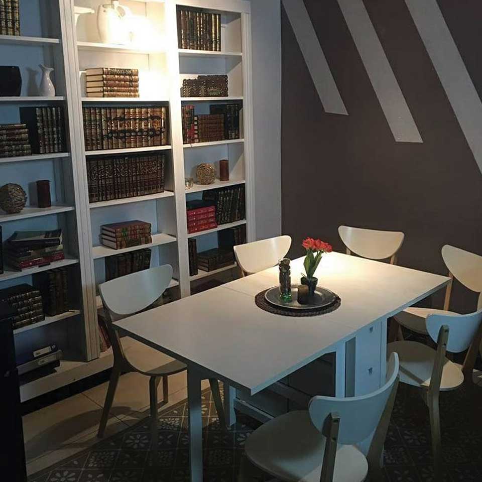
The team choose to go with grey for this house. Even though this colour is often associated with industrial environment , we know it never draws attention to itself; as it keeps its distance and remain separate. Grey doesn’t have a ‘personality’ of its own, paired with any other colour, it allows that colour to be visible whilst grey takes a back seat. By understanding this we painted two of the walls white colour shade, and added geometric diagonal lines on the grey wall. The painting used was made of glass variation, and this added texture and dimension to the wall. The glass variation paint had some glitter added to it, as a result; the white pattern complements the dining set, and the book shelf behind it.
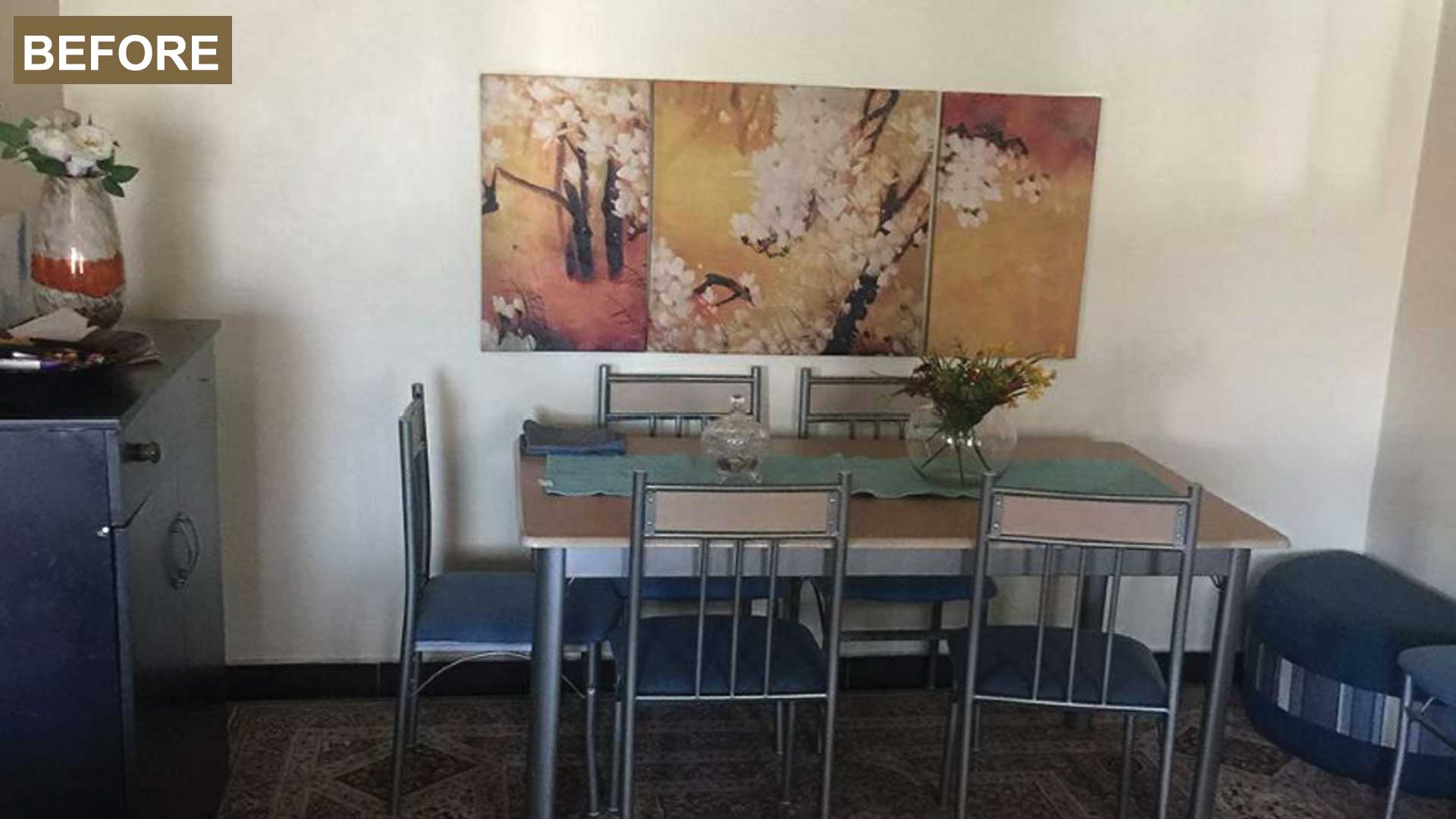
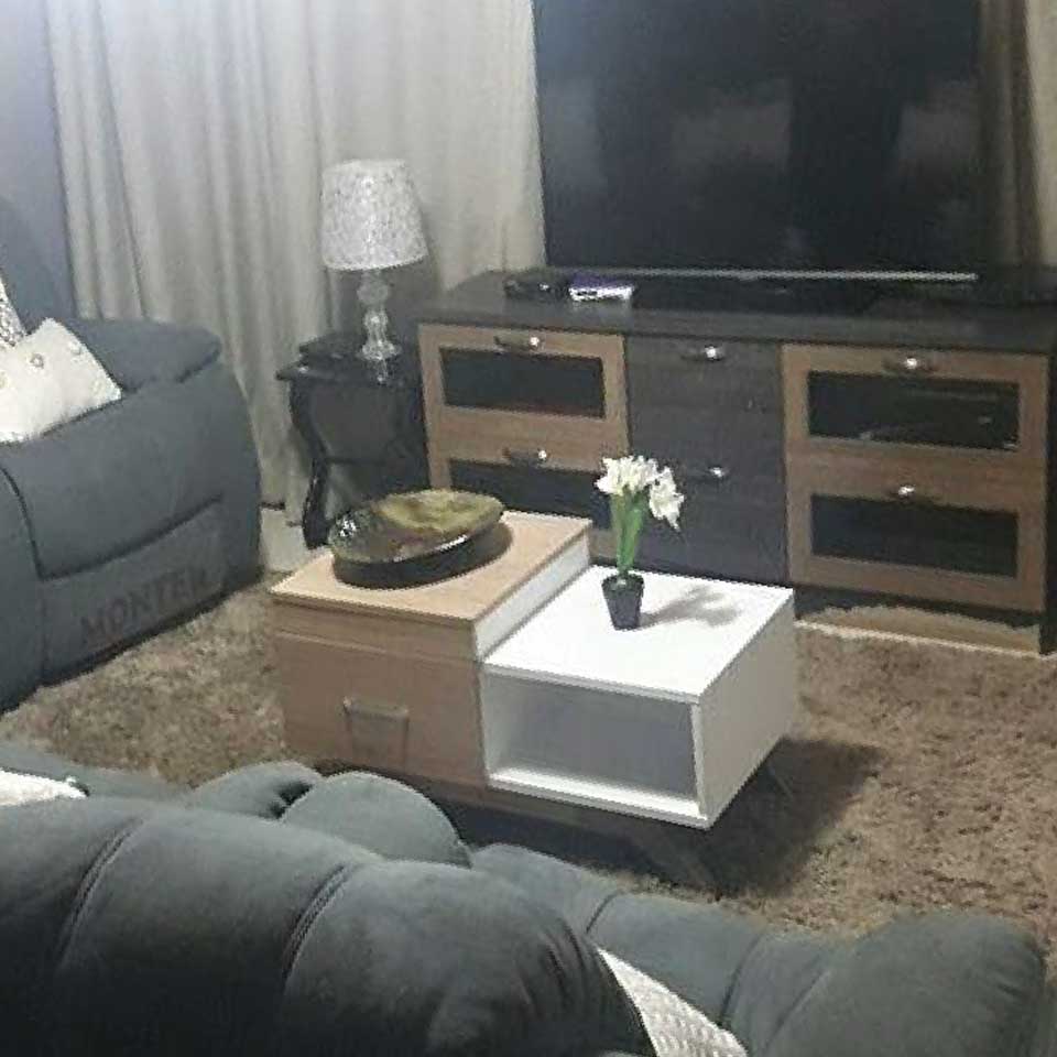
Due to the client modern look request, we went forth and created a space that was more neutral and cozy. This was achieved because of the grey colour selection; as a result, it gave us option to design in many ways.To bring this look together we had to import the furniture: the grey recliner, and the dining was from IKEA. The TV stand was among the furniture retained by the client
before the renovation.
Sitting room decoration
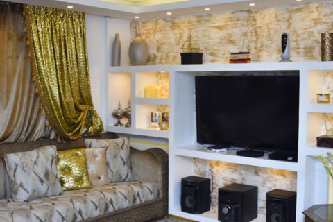
To create a focal point in the sitting room area, we decided to design a bookshelf for the client. We opted for a white colour to complement the dining furniture from IKEA and the walls. Since the client had many book, but no space to place them: our designer customade her a shelf that was able to hold all her books. The location behind the dining in a way created a distance and solitude between main sitting and the reading area. We decorated the shelf with books and ceramic white vases that brought the whole look together. We also customade the triple vases placed them on the TV stand; the colour sprayed on the carved wooden vases was silver to complement the silver/ glitter found on the paint.
For the soft furnishing our interior designer customade the curtains and the decoratives cushion around the sitting space. We decided toadd some colour on the grey sofa; as a result we added yellow and white cushions and added a brown throw to balance the brown colour of the carpet.
Shades of purple
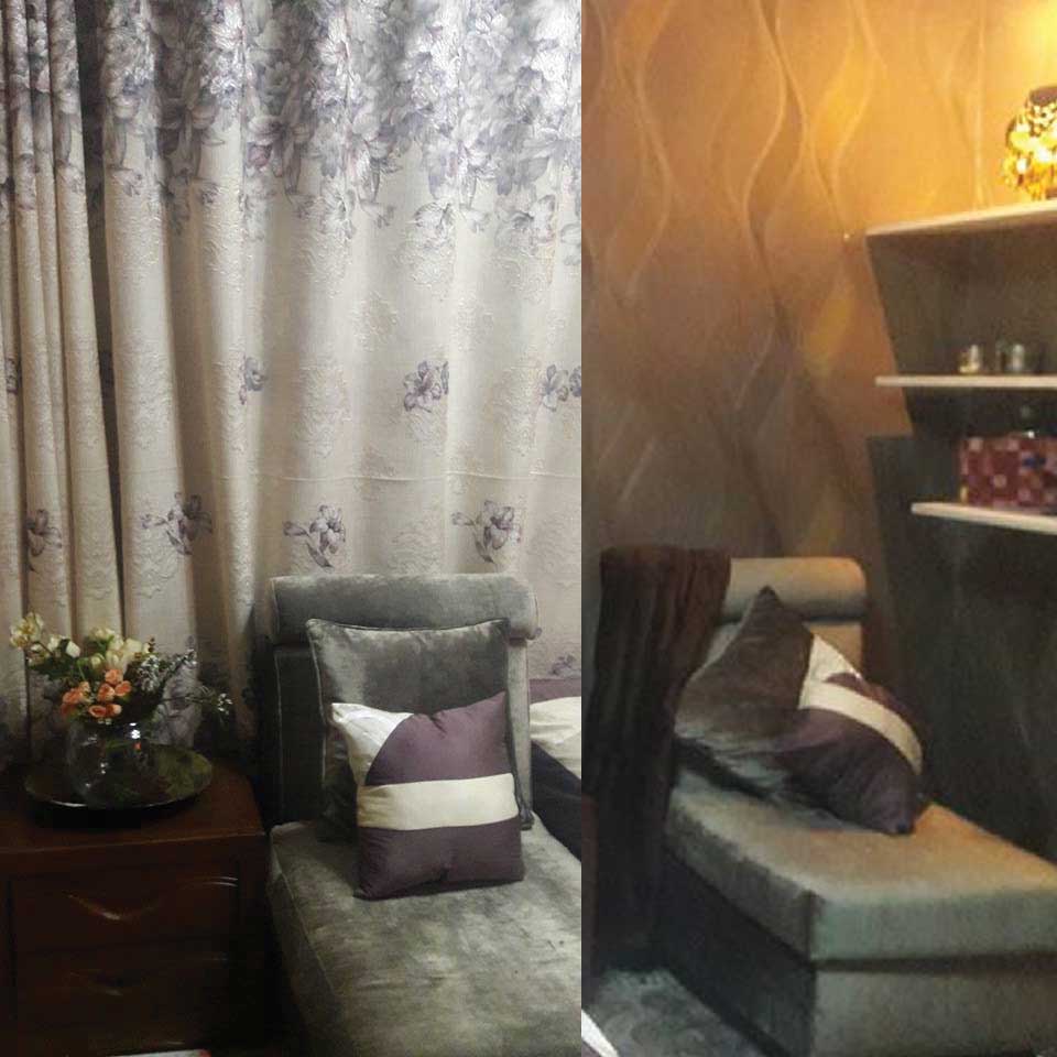
On the bedroom we did a simple wooden bed and two armless chairs, because of lack of space. The chairs were also decorated with customade decorative cushions to match the colour on the curtains. To give the client extra storage place we did a floating shelves that was accessorized with the client accesories. To highlight these shelves we added spotlight to create an ambience around the space.
To emphasize the wall behind the headboard we opted for a grey textured wall paper. This gave us and dramatic look which worked really well with the velvet material of the two armchairs. For the bedroom curtains we went with an off white purple patterned look to match bed coverings and cushions.
Effective Lighting
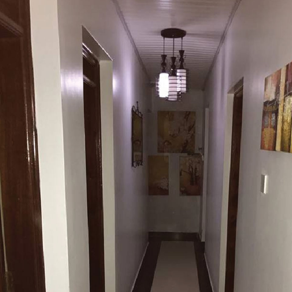
Because lighting plays an important role in a space look; for the bedroom lighting we went for a Victorian looking pendant which was attached to the wooden ceiling. When lit the light bounced off the shiny surface to create a beautiful glow. For the sitting room, the light chosen was designed in layers of petal. Since the look in this room was more contemporary it worked well with everything around the space
shades
Perfect combination of Design & Functionality
